CSS3 transform scale scaling problem

encountered a problem, introduced animate.css into the vue project to implement transition animation, but there were some strange problems. The problem with
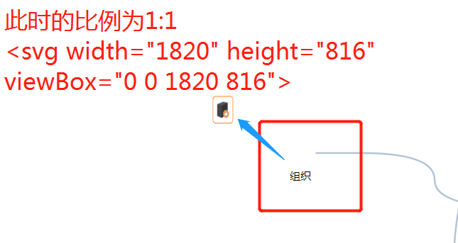
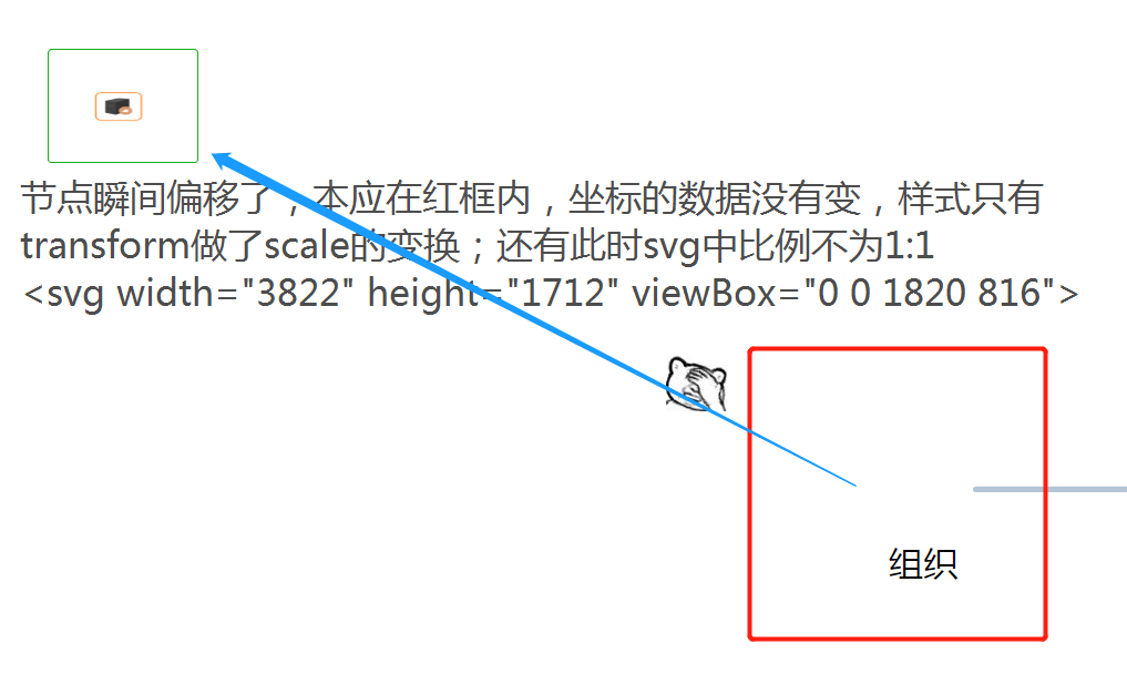
is shown in the figure
clipboard.png
1:1

clipboard.png
. I really don"t know how to describe the problem in this figure. the same code is inconsistent in the Google browser of different computers . One shows normal , while the other shows a problem as shown in the figure. The position of has shifted . After confirming the same code, the browsers are all latest version of Google browser

. The style that works in

animate.css is

.rubberBand {
  animation-name: rubberBand;
}
@keyframes rubberBand {
  from { transform: scale3d(1, 1, 1); }
  30% { transform: scale3d(1.25, 0.75, 1); }
  40% { transform: scale3d(0.75, 1.25, 1); }
  50% { transform: scale3d(1.15, 0.85, 1); }
  65% { transform: scale3d(0.95, 1.05, 1); }
  75% { transform: scale3d(1.05, 0.95, 1); }
  to { transform: scale3d(1, 1, 1); }
}
.animated {
  animation-duration: 1s;
  animation-fill-mode: both;
}

key code of the project is

<svg :width="panelObj.panelWidth" :height="panelObj.panelHeight"`" :viewBox="`${panelObj.viewBoxX} ${panelObj.viewBoxY} ${panelObj.viewBoxWidth} ${panelObj.viewBoxHeight}`" >
  <!--  -->
  <g v-for="(node,i) in nodesList" :key="i">
    <foreignObject :x="node.x" :y="node.y" :width="node.width" :height="node.height">
      <img class="animated rubberBand" :src="node.img" :width="node.width" :height="node.height"/>
    </foreignObject>
    <!--  -->
    <text :x="node.x+node.width/2" :y="node.y+node.height">{{node.label}}</text>
  </g>
</svg>

if you still use this scheme to realize animation , how to adjust to make it perform normally

Jun.06,2022

try transform-origion specify the origin coordinates


recently found problems on viewBox and transform . The solution to the
solution is to avoid using transform and replace the representation in other ways, such as margin+width+height for scale .

@keyframes rubberband {
  from { margin:0; width:100%; height:100%; }
  30% { margin:12.5% 0 0 -12.5%; width:125%; height:75%; }
  40% { margin:-12.5% 0 0 12.5%; width:75%; height: 125%; }
  50% { margin:7.5% 0 0 -7.5%; width:115%; height:85%; }
  65% { margin:-2.5% 0 0 2.5%; width:95%; height:105%; }
  75% { margin:2.5% 0 0 -2.5%; width:105%; height:95%; }
  to { margin:0; width:100%; height:100%; }
}

The transfrom of the element of

svg is different from the normal html element.

you can refer to this article by Zhang Xinxu
https://www.zhangxinxu.com/wo...

The CSS3 transform of the
HTML element is quite different from the transform coordinate system of SVG; the specific syntax details are different. The syntax of the SVG transform attribute has a bit of an offset. CSS transform is purer.
usually we use transform whose coordinates are relative to the current element. The default is the transformation of the center point of the element. We can change the center point of the transformation through the transform-origin attribute. The coordinate transformation of transform in SVG is calculated relative to the upper-left corner of the canvas, which is quite different from the transform of HTML, and it is more difficult to understand.
Menu