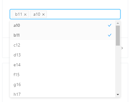
if I don"t support it, how can I add a checkbox to the control to realize the one-click all / empty selection function? does the god know

if I don"t support it, how can I add a checkbox to the control to realize the one-click all / empty selection function? does the god know

in my previous answer, I talked about how to use additional buttons to control the change of selected values in the component, but the extra buttons may not look good if they are placed near the option box. I'll provide a solution for putting the select all button on the drop-down list.
refer to the official documentation use dropdownRender to freely extend the drop-down menu.< table > < thead > < tr > < th align= "left" > parameters < / th > < th align= "left" > description < / th > < th align= "left" > Type < / th > < th align= "left" > default < / th > < th align= "left" > version < / th > < / tr > < / thead > < tbody > < tr > < td align= "left" > dropdownRender < / td > < td align= "left" > Custom drop-down box content < / td > < td align= left "> (menuNode: ReactNode, props) = > ReactNode < / td > < td align= "left" >-< / td > < td align= "left" > 3.11.0 < / td > < / tr > < / tbody > < / table >
   currently  Select  components do not provide configuration for this property
 you can bind Select to a controlled component (value is bound to state)
 and then add a select / empty button on the right
 to change the value of state when you click.
thousands of pieces of data returned by the background interface are put in the Select. Users select a certain piece of data and find it very stuttered. Is there any way to solve it ? this is the official demo of antd const { Select } = antd; const Op...
The form has a start and end date, which requires context. How can it be cross-validated? the problem I encountered is: step1: first set the start date to 3br 23 step2: sets the end as scheduled to 3x21, the end date component verification prompt "c...
for example, in a very large form, each form item item is wrapped by getFieldDecorator, because the onChange event of the wrapped input component triggers the forceUpdate, on the Form.create layer, so the whole form will be re-render at this time, if i...
.roomhogrc.mock.js is configured as follows: const noProxy = (process.env.NO_PROXY === true ); GET api currentUser : { $desc: "", $params: { pageSize: { desc: , exp: 2, }, }, $body: { name: Serati Ma , avatar: ...
how to modify the top of the Antd Transfer shuttle box like this ...
as shown in the figure: when each record is clicked to edit, the form displays the corresponding record value. My practice is to click to edit the record to obtain the record and store it in state.formData. How to pass state.formData as a props paramete...
tree select component search for questions. import React from react ; import {TreeSelect} from antd ; const treeData = [{] label: Node1 , value: 0-0 , key: 0-0 , children: [{ label: Child Node1 , value: 0-0-1 , key:...
use the Table form plug-in and find that there is a Warning prompt on the console. How to solve this prompt? Baidu said to add rowKey= "id ", and found that there was still a warning prompt. Warning: Each record in table should have a unique `key` pro...
there are two data sources A, B. on the page with four columns in a row (one piece of data is a Card, row and four Card), such as: A1, B1, A2, B2. is as follows: dataSource= {data}, data is the data source of An and B together, item= {A1, B1}, but th...
datepicker of antd cannot set error message with form.setFields <FormItem label= {...formItemLayout}> {form.getFieldDecorator( startTime , { rules: [ { required: true, message: , }, { vali...
mock, is used in ant-design-pro. Now I m going to call the test server interface api. I banned mock in .uplohogrc.mock.js modified mock according to ant-design-pro s official documentation const noProxy = (process.env.NO_PROXY === true ); ....
1. After filtering the antd pro table list display page, click the header query button. The data is all data, but the selection in the filter box is still there. How to remove it 2, [full check data display] [] [] ...
sliding the Carousel component of antd has no effect, it can be slid on its official website, but it is not good for copy to come and put it on its own project! ...
the default root route for packaging is " " , how to change the packaged root route to " test " other routes should also be based on test url to display ....
routes={[ { path: search products , breadcrumbName: }, { path: goods-details , breadcrumbName: }, ]} params={{ ...
is refactoring a project with ant design pro. Some of the requirements are as follows: : , , , , (), (), ,PS: , 5, , : now the data structure returned by the backend is level 1: [{name: daily cleaning , level: 1, id: rihuaqingjie },.] level ...
when I use nz-table, because it is used in the ngx modal box of the pop-up bootstrap, when using paging support, the drop-down page number selection menu is displayed in the lower part of the modal box, and cannot be used when it is displayed by the moda...
our project uses antd 3.6 +. Without network access, there will be one request, http: keycart.alipay.com web. I checked the user experience program that is said to be antd. Could you tell me how to close this user experience program? because we use b...
RT version: 2.13.11 I have a login dialog box, tab switch password login while verification code login finally export a form field: Form.create () (AppComp) so both sides must not pass, so I want to update the configuration of getFieldDecorator ...
as shown in the picture, click on the cell to display the select control and select the field type. Click outside the cell, and the cell returns to its original appearance ...