How to create a semicircular css?

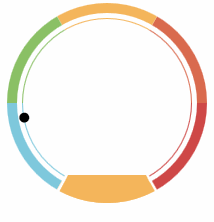
is like this. I want to implement this function


clipboard.png

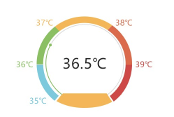
this indication, this is dynamic, so it cannot be made into a background picture.

the function I want to achieve is this small circle, indicator, you can move along this circle all the time. First of all, you have to make the instructions of this circle and this circle. I think I can solve the rest of the animation on my own.

could you tell me that this ring has a point? how can this be realized?

Jun.14,2022

<!DOCTYPE html>
<html lang="en">
<head>
    <meta charset="UTF-8">
    <title>Arc</title>
    <style type="text/css">
    .box {position:relative;margin:100px;width:200px;height:200px;border-radius:50%;overflow:hidden;}
    .box .pie {position:absolute;bottom:50%;left:50%;width:100%;height:100%;background-color:rgba(0,0,0,0.3);box-sizing:border-box;}
    .box .pie-1 {background-color:RGB(218,106,78);transform-origin:left bottom;transform:rotate(0deg)  skew(-30deg);}
    .box .pie-2 {background-color:RGB(244,181,91);transform-origin:left bottom;transform:rotate(-60deg)  skew(-30deg);}
    .box .pie-3 {background-color:RGB(138,192,101);transform-origin:left bottom;transform:rotate(-120deg) skew(-30deg);}
    .box .pie-4 {background-color:RGB(126,200,221);transform-origin:left bottom;transform:rotate(-180deg) skew(-30deg);}
    .box .pie-5 {background-color:RGB(244,181,91);transform-origin:left bottom;transform:rotate(-240deg) skew(-30deg);}
    .box .pie-6 {background-color:RGB(206,72,71);transform-origin:left bottom;transform:rotate(-300deg) skew(-30deg);}
    .box .pie-bottom {border:3px solid -sharpFFF;}
    .box .base {position:absolute;top:10px;left:10px;width:180px;height:180px;border-radius:50%;border:5px solid -sharpFFF;box-sizing:border-box;}
    .box .info {position:absolute;top:1px;left:1px;width:168px;height:168px;border-radius:50%;background-color:-sharpFFF;box-sizing:border-box;}
    .box .dot {position:absolute;margin-top:-5px;margin-left:-5px;top:100px;left:184px;width:10px;height:10px;border-radius:50%;background-color:-sharp000;transform-origin:-79px center;transform:rotate(-130deg);}
    .box .patch {position:absolute;bottom:0;left:50%;width:106px;transform-origin:center bottom;transform:translate(-50%, 0);border-left: 14px solid transparent;border-right:14px solid transparent;border-bottom:28px solid RGB(244,181,91);box-sizing:border-box;}
    </style>
    <script>
    document.addEventListener('DOMContentLoaded', function(){

        let domDot = document.querySelector('.box .dot');
        let dotDeg = 0;

        function update_dot()
        {
            domDot.style.transform = 'rotate('+dotDeg+'deg)';

            dotDeg += 5;
            if(dotDeg >= 360)
                dotDeg = dotDeg % 360;
            if(dotDeg >= 60 && dotDeg <= 120)
                dotDeg = 120;

            setTimeout(update_dot, 250);
        }

        setTimeout(update_dot, 0);
    });
    </script>
</head>
<body>
<div class="box">
    <div class="pie pie-1"></div>
    <div class="pie pie-2"></div>
    <div class="pie pie-3"></div>
    <div class="pie pie-4"></div>
    <div class="pie pie-5 pie-bottom"></div>
    <div class="pie pie-6"></div>
    <div class="base">
        <div class="info"></div>
    </div>
    <div class="dot"></div>
    <div class="patch"></div>
</div>
</body>
</html>

consider using SVG to try


consider using SVG implementation: https://sunmengyuan.github.io...

Please refer to https://codeshelper.com/a/11...

for specific ideas.
Menu